Before we dive in, let me provide some background.
In 2013, a bunch of people signed the extensible web manifesto, in favor of an Extensible Web Platform. The goal is pretty obvious: elaborate new kind of standards, that provides authors freedom and flexibility to build their own features. The aim is to define low-level APIs, an access to the core of the browsers, and so, involve authors into the innovative process, without restrict them to the historic standards.
In the HTML ecosytem, web components arise from that philosophy. Many standards have been set up, and we’re now able to build our own HTML components, thus extending the HTML language. Of course, the solution is based on web languages: HTML, CSS and JavaScript.
On the CSS land, that’s the ambition of CSS Houdini: new standards to design our own graphic effects, our own layouts, and maybe our own extensions (new selectors, new properties, new functions, etc.), ans so on. In one word, extend CSS as we want.
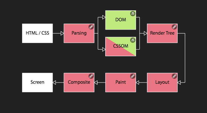
Technically, it is possible by enabling access to every phase browsers perform to render text files as pixels on screen. We can break down every phase that way:
- the first phase is the parsing, the browser reads and deciphers HTML and CSS files
- the browser builds the DOM and the CSSOM, object’s representation of these files
- from that, derive the Render Tree, or Layer Tree, a kind of a list of styles to be applied to each elements
- then, the browser draws each element going through 3 steps:
- Layout, the browser applies layout rules (display, sizes, margins, etc.) and thus, builds the architecture. We also use the word reflow.
- Paint, the browser applies graphical rules (backgrounds, borders, images). We also use the word repaint.
- Composite, a compositing phase, which stacks together layers created from specific CSS properties (transforms, opacity, etc.). Often performed by the GPU and in a separate thread.
Right now, if we want to build a fancy graphic effect, we have to alter the DOM. That’s the only available phase to the core mechanism of browsers.
The ambition of CSS Houdini is to enable all internals steps, as shown in image below.
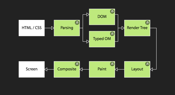
To make this happen, many new APIs (mostly JavaScript) are actively standardized.
You can notice that CSSOM (pretty complex and badly implemented by browsers) is more or less replaced by Typed OM. This new, more robust, standard is an object-based API to manipulate CSS (files, at-rules, selectors, declarations, properties, values, etc.).
Typed OM is therefore useful every time you have to handle CSS with JS. Like for example to limit risky concatenations:
// CSSOM
el.style.setProperty('transform', 'translate(' + x + 'px, ' + y + 'px)')
// Typed OM
el.attributeStyleMap.set('transform', new CSSTranslate(CSS.px(x), CSS.px(y)))
Or simply, to retrieve values as objects instead of strings:
// CSSOM
getComputedStyle(el).getPropertyValue('width')      // '50px'
// Typed OM
el.computedStyleMap().get('width')                  // CSSUnitValue {value: 50, unit: 'px'}
CSS Houdini makes extensively use of JavaScript.
Note: you can find CSS Houdini support on https://ishoudinireadyyet.com. You’ll notice that Chrome (and Chromium-based) is leading, but it’s a bit embellished (well, the website is maintained by Google’s developers). I’ll add details along the article. For Typed OM, only a subset of all CSS properties is supported, but there is a list.
Build our own properties
Now, talk about use cases.
For many years, it was already possible to create our own CSS properties, thanks to custom properties. We also know them as CSS variables.
Let’s take the box-shadow property. If we want to change one of its value, we need to rewrite the whole rule, like in this example to change the blur size on hover
.el {
  box-shadow: 0 3px 3px black;
}
.el:hover {
  box-shadow: 0 3px 10px black;
}
Thanks to CSS custom properties, we can define a property, say --box-shadow-blur, and only alter it afterwards. We can use it from the initial state, thanks to the var() function
.el {
  --box-shadow-blur: 3px;
  box-shadow: 0 3px var(--box-shadow-blur) black;
}
.el:hover {
  --box-shadow-blur: 10px;
}
It’s really convenient. But, in that specific case, we can’t animate the property. Browsers don’t know what is the expected type, and how to handle it.
This is where the Properties & Values API from Houdini comes in handy. That specification defines the new at-rule @property (in CSS) and CSS.registerProperty() (in JS), that allow to register a new custom property, by specifying the expected type. One benefit is that browsers will now know how to animate it (if possible). Let’s go back to our previous case, and register our new property
.el {
  --box-shadow-blur: 3px;
  box-shadow: 0 3px var(--box-shadow-blur) black;
  transition: --box-shadow-blur .45s;
}
.el:hover {
  --box-shadow-blur: 10px;
}

@property --box-shadow-blur {
  syntax: "<length>";
  inherits: false;
  initial-value: 0;
}
There you go, a nice hovering animation, only updating the desired value.
This is a first step to extend CSS: ask browsers to learn a new property, previously unknown. And animations aren’t the only purpose of registering custom properties. It can also improve peformance overall, by specifying that a custom property doesn’t inherit (it will prevent browsers to update styles of many nested elements).
By the way, avoid adding too many custom properties on
:rootorbodyelements. You will face some performance pitfalls.
Support for registering properties is only Blink-based browsers (Chrome, Opera, Edge) for now. However, in both cases (CSS & JS), not every types are implemented (also bound to Typed OM), without exhautive list.
Build our own graphic effects
Nowadays, the only graphic effects availables are the ones defined by the language. Backgrounds colors, borders, gradients, rounded corners, shadows, etc. Well, you know that.
The future CSS Paint API standard, as the name suggests, enables the browsers’ Paint phase. This standard describes an isolated execution environment (a worklet), in which we can programmatically draw an image, like in a HTML <canvas> element. That image can then be used with image-related CSS properties, mainly background-image, border-image and mask-image.
This new standard defines:
CSS.paintWorklet.addModule('paint.js')to load a workletregisterPaint()to create the image inside the worklet (in a separate file)- the CSS
paint()function to use the worklet
The worklet’s code is thus isolated from the rest of the page, and called during the Paint phase, making the drawing very performant, because browsers no longer need to execute every steps each time. Moreover, browsers can easily improve performance of that specific code (execute it in a separated thread for example).
Let’s take a rather simple effect, no so easy to create: an element with a slanted side, as shown in the image below:
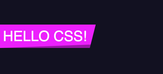
We should be able to design it using a linear gradient, or maybe transformations, but responsive will be hard (and dealing with font sizes also). In any case, many elements or pseudo-elements would be involved.
With Houdini, it becomes so easy. First step, register a new worklet, with our drawing instructions, called slanted:
registerPaint('slanted', class {
  paint (ctx, geom) {
    ctx.fillStyle = 'hsl(296, 100%, 50%)';
    ctx.beginPath();
    ctx.moveTo(0, 0);
    ctx.lineTo(geom.width, 0);
    ctx.lineTo(geom.width - 20, geom.height);
    ctx.lineTo(0, geom.height);
    ctx.fill();
  }
})
Its paint() method contains drawing commands that build the slanted shape, and can use its 2 arguments:
ctxis the drawing contextgeomis an object containing the size of the element where the painting will occur
The drawing is based on simple commands, as for the HTML <canvas> element: moveTo() to move the pointer, lineTo() to draw a straight line, etc.
Then, we need to load the worklet and call it from our CSS:
.el {
  background-image: paint(slanted);
}
And voilà! The rendering is responsive by default, and automatically redrawn every time the element’s size change (try edit the text).
It’ll become really interesting when we’ll retrieve custom properties values from inside the worklet, and combine them with animations. To start, let’s build a new worklet in which we’re drawing a circle that adapts to the smallest size of our element:
// New worklet
registerPaint('circle', class {
  paint(ctx, geom, props) {
    // Get the center point and radius
    const x = geom.width / 2;
    const y = geom.height / 2;
    const radius = Math.min(x, y);

    // Draw the circle
    ctx.fillStyle = 'deeppink';
    ctx.beginPath();
    ctx.arc(x, y, radius, 0, 2 * Math.PI);
    ctx.fill();
  }
}Next, we’re registering a new custom property --circle-color from CSS, and using it inside the worklet, thanks to the third props argument of the paint() method:
.el {
  --circle-color: deepskyblue;
  background-image: paint(circle);
}

@property --circle-color {
  syntax: "<color>";
  inherits: false;
  initial-value: currentcolor;
}
registerPaint('circle', class {
static get inputProperties() { return ['--circle-color'] }
paint(ctx, geom, props) {
...
ctx.fillStyle = props.get('--circle-color').value;
...
}
}The background of the circle is now authorable right from CSS.
Last step, creating three new custom properties, --circle-x and --circle-y to set the circle’s center, and --circle-radius to its size. These three properties are then bring back inside the worklet
registerPaint('circle', class {
  static get inputProperties() {
    return [
      '--circle-color', '--circle-radius', '--circle-x', '--circle-y'
    ]
  }
  paint(ctx, geom, props) {
    const x = props.get('--circle-x').value;
    const y = props.get('--circle-y').value;
    const radius = props.get('--circle-radius').value;
  }
}
At initial state, the circle’s size is 0, and that property will be animatable in CSS.
.el {
  --circle-radius: 0;
  --circle-color: deepskyblue;
  background-image: paint(circle-ripple);
}
.el.animating {
  transition: --circle-radius 1s,
              --circle-color 1s;
  --circle-radius: 300;
  --circle-color: transparent;
}
To finish, we set the center (x, y) in JS each time the user clicks on the element. We’re adding the class to animate the size.
el.addEventListener('click', e => {
  el.classList.add('animating');
  el.attributeStyleMap.set('--circle-x', e.offsetX);
  el.attributeStyleMap.set('--circle-y', e.offsetY);
});Boom! The famous ripple effect from Google Material Design in a few lines of code. And, a very performant solution.
Thanks to these kind of worklets, we can consider many new effects, or at least make some easier to build. In all my experiments, you can check how to create a tooltip arrow, a superellipse (aka, iOS rounded corners), rough borders or highlighter marker annotations, corners gradient, or a randomly irregular grid if we combine it with CSS masks.
Support of CSS Paint API is only Blink-based browsers. And not 100%: attributes of the CSS paint() function are not supported yet. Using attributes, instead of custom properties, we can produce different results on the same element, as it is shown on the inset borders demo
Also, all Houdini APIs are closely tied together. To retrieve a custom property from inside a worklet, and use it as object, browsers should implement the Properties & Values API (to register a custom property’s type) and also Typed OM. Even Chrome has an unpredictable implementation. Many tests are required to discover what is supported.
Build our own layouts
With the same approach, a specific kind of worklet exists to create its own layout mode. This is defined by the CSS Layout API standard.
In the same way Flexbox or Grid work, you can write your own layout engine to lay out elements inside a container. How? Well, as for the CSS Paint API:
CSS.layoutWorklet.addModule('layout.js')to load a workletregisterLayout()to build your layout rules inside the worklet- the CSS
layout()function to apply the worklet, using thedisplayproperty
Although Flexbox and Grid are giving us many possibilities, some layouts are unachievable in CSS. The most popular one is the Masonry layout. Thanks to that new API, it becomes possible, in around 40 lines of JS:
// Code from https://github.com/GoogleChromeLabs/houdini-samples/blob/master/layout-worklet/masonry/masonry.js
registerLayout('masonry', class {
  async layout(children, edges, constraints, styleMap) {
    const inlineSize = constraints.fixedInlineSize;

    let columns = Math.ceil(inlineSize / 350);
    let padding = 10;

    // Layout all children with simply their column size.
    const childInlineSize = (inlineSize - ((columns + 1) * padding)) / columns;
    const childFragments = await Promise.all(children.map((child) => {
      return child.layoutNextFragment({fixedInlineSize: childInlineSize});
    }));

    let autoBlockSize = 0;
    const columnOffsets = Array(columns).fill(0);
    for (let childFragment of childFragments) {
      // Select the column with the least amount of stuff in it.
      const min = columnOffsets.reduce((acc, val, idx) => {
        if (!acc || val < acc.val) {
          return {idx, val};
        }

        return acc;
      }, {val: +Infinity, idx: -1});

      childFragment.inlineOffset = padding + (childInlineSize + padding) * min.idx;
      childFragment.blockOffset = padding + min.val;

      columnOffsets[min.idx] = childFragment.blockOffset + childFragment.blockSize;
      autoBlockSize = Math.max(autoBlockSize, columnOffsets[min.idx] + padding);
    }

    return {autoBlockSize, childFragments};
  }
});
Then, CSS side:
.el {
  display: layout(masonry);
}
To see result, load the following CodePen in a Blink-based browser, with the Web Platform flag enabled
Well, JS code may seems complex at first, but not that much in reality. And above all, the code is isolated from the rest of the page, and called only during the Layout phase, which makes it very performant, as explained before.
Of course, we can build many other layout systems, like the ones used when designing iOS/Android applications. As an example, Google engineers implemented the Android’s RelativeLayout. We can also be more creative, and build a layout where elements are set along a SVG path, defined on a custom property:
.el {
  display: layout(svg-path);
  --path: path("M100,300c100,-100,150,-120,300,0c150,50,300,0,400,-200");
}
In that specific case, it prevents us from using absolutely-positionned elements, with arbitrarily values. Maybe we could achieve a similar effect using the CSS Motion standard (not Houdini) and the offset property, but SVG path isn’t responsive by default (so JS needed) and CSS should set how many items will be laid out on path beforehand.
Support of CSS Layout API is very limited right now. Only Blink-based browsers, with Web Platform flag enabled. This is just the beginning.
Even more?
There is a last kind of worklet inside Houdini, dedicated to animations performance, the Animation Worklet API, based on WAAPI (Web Animations API). As for the other worklets, animation code is isolated, but above all, it extends the concept of time-based baseline. It could be pretty useful to get performant animations based on user’s interaction, as for the scroll for example (manual, but also animated):
Let’s take an example, a new worklet that register a simple linear animation (1 to 1)
registerAnimator('simple', class {
  animate(currentTime, effect) {
    effect.localTime = currentTime;
  }
});
The worklet is loaded, and we create a new JS animation:
- that updates a custom property
--anglefor a duration of 1 (with value from 0 to 1 turn) - based on scroll (
new ScrollTimelinewithscrollSource: scrollElement) and “time” is equivalent to 1
CSS.animationWorklet.addModule('...').then(r => {
  new WorkletAnimation('simple',
    new KeyframeEffect(el, [
        { '--angle': 0 },
        { '--angle': '1turn' }
      ],
      { duration: 1 }
    ),
    new ScrollTimeline({
      scrollSource: scrollElement,
      timeRange: 1
    }),
  ).play();
});
Finally, the --angle custom property is used in CSS to rotate an entire cube in 3D
.cube {
  --angle: 0;
  transform: rotateX(var(--angle)) rotateZ(45deg) rotateY(-45deg);
}
To see result, load the following CodePen in a Blink-based browser, with the Web Platform flag enabled
Support of Animation Worklet is only Blink-based browsers for now, and with Web Platform flag enabled
The ambition of CSS Houdini is to go even further. Nothing really exists for now, but we can mention:
- the CSS Parser API to enable the first phase of browser rendering: read and parse files. I suppose that it will enable us to create our own functions, our own selectors, etc., as we should be able to handle them by ourselves. It is still unclear whether and how everything will work.
- the Font Metrics API to get the font metrics from CSS. And this could be very cool.
So, real magic or smoke and mirrors?
We could be very exited about all of this (and I am). But, we should take some points into consideration.
New features
These new APIs boost creativity, by allowing the creation of new effects, or simplifying actual ones.
As mentioned earlier, we can create our own properties, but unfortunately we can’t really extend existing features. Speaking of box-shadow’s blur, it is for example impossible to create a directional blur, splitting it in two sub-properties --box-shadow-blur-x and --box-shadow-blur-y. As there is no way to “hack” shadow drawing from browsers.
And even if the CSS Paint API seems ultramodern, it is nothing more than a performant version of -webkit-canvas() that exists since 2008, but now removed from Chrome.
The drawing is executed in a canvas, via its rendering context CanvasRendering2D (and a limited one). That rendering context was not initially designed for CSS, thus many limitations are emerging:
- no simple way to handle borders (
border-clip, multiples, etc.), nor shadows, nor background images (repetition, position, size, etc.) - not really convenient to draw outside the background area of an element (doable combining
border-image+border-outset) - no way to deal with texts
- nothing new to style form elements
- etc.
In many cases, SVG is a far better and simpler choice. There are many effects that are undoable today, and Houdini wouldn’t help much.
Regarding the CSS Layout API, only complete layout mode are achievable (like Flexbox or Grid). It’s a big step forward, but we’re not able to modify how CSS works.
It is therefore impossible to set sizes, nor margins, on one element, nor change its containing block (for absolutely-positioned elements for example) or stacking context (in particular when there is conflict between properties), nor even to add new pseudo-elements or new entities (maybe, it’s rather a web components use case?). Nothing new for container queries neither.
Polyfill
One of the main purpose of CSS Houdini is to be able to create polyfills (write own code for browsers that lack support). It’s true, Houdini can help, but keep in mind that browsers that implement Houdini but do not support other feature are very rare. Here are some counter-examples I can think of:
- the
corner-shapeproperty isn’t implemented in any browsers, but doable with the Paint API - the
subgridmode from Grid Layout supported in Firefox, doable with the Layout API - the
filter()function supported in Safari and doable with the Paint API - and presumably more
However, no magic here, the vast majority of CSS is non-polyfillable1
Performance
This is the key point of CSS Houdini: improve performance of browser rendering. Right now, in 2020, build performant UIs is very restrictive, and even more when animated. Layout properties (width, height, margin, left etc.) and even graphic ones (background-color, background-size, etc.) are very expensive to render. That’s why transform and opacity are overused, because these specific properties are rendered during the compositing phase, and often in a separate thread.
As an example, see how a box-shadow can be animated efficiently (spoiler: animate the opacity of a pseudo-element instead)
The use of worklets, isolated from the page and the main thread 2, gives performant results, without the exclusive use of transform/opacity. And this is great!
Ironically, my first demo above (registering a custom property to set box-shadow’s blur) is not performant, cause there is no worklet involved.
Regarding the Animation Worklet API, I’m personally not a fan of that solution. WAAPI is, in my opinion, good enough to build performant animations, and to deal with transitions/animations in CSS. To create a scroll-based timeline, I do prefer the Scroll-linked Animations specification, with the animation-timeline property and @scroll-timeline, but that is not part of Houdini.
Browser engine innovation
We can’t talk about rendering performance, with no mention to browser engines. As of today, there are 3 modern browser rendering engines: Blink (Chrome, Opera, Edge, etc.), WebKit (Safari), and Gecko (Firefox).
Houdini APIs are based on a rendering consensus, which is pretty much the same in each major browsers, but we should mention the new Firefox rendering engine: WebRender. The goal of this new core component is to revolutionize the rendering process, by combining the Paint and Compositing phases, and send the whole elements to the GPU, as for video games. It is still in early stage, but once in place, techniques using transform/opacity will be obsoletes. And according to @gsnedders, Houdini APIs that are designed to fix performance issues in the actual context, could be harder to implement in a different one.
And this is problematic, either for innovation, or for Houdini.
Everything is JavaScript
We can regret the biggest part of all APIs is JavaScript. CSS Houdini is basically JS-in-CSS. No JS, no styles.
Personnally, I’d have liked to be able to use SVG from a worklet. Declarative languages are sometimes better than imperatives ones. But to be performant, Blink/Webkit should hardware accelerate SVG rendering first. It will be soon in WebKit
In any case, it therefore appears that the produced code is complex to write and to set up. Above all, it is often more complex than classic JS, using the DOM.
Without going deep dive, worklets are autonomous environments, and cannot handle state. To be reliable, browsers should instanciate 2 different worklets, and render only one, indifferently. It makes really difficult to achieve some simple effects, like this one on rough borders, where each repaint draws different borders. I’ve had a lot of trouble with that. Alternatives exist, but once again, it makes code harder and thus leads to more side effects.
More simply, you should not under estimate the loading time of JS, and also the non-presence. And also Houdini support. As of today, styles set using paint() and layout() produce FOUC (Flash of Unstyled Content).
Progressive enhancement is more relevant than ever. But will be harder to ensure.
Security
Giving developers more control on browsers core engine, leads to security concerns. Main limitation is that worklets can only be used on HTTPS site. No secured website, no CSS. That is harsh 3.
Despite this point, researchers have been able to exploit a vulnerability that easily retrieves a user browsing history. The Chrome team workaround was to prohibit the paint() function on HTML links. Again, it’s a big constraint that will limit wide adoption, if no other solution can be found.
More importantly, how will it take to find new security breach? Will the future of CSS Houdini is bound to the CSS Shaders one (custom filters to apply WebGL shaders, right from CSS), removed overnight from browsers that already started development?
Conclusion
That new way to design standard is interesting. It gives more power to authors, and includes them in the innovative process. With CSS Houdini, new effects are achievable, in a performant way in actual browsers. But, here comes with constraints: more JS, harder to use, security, etc.
In any cases, CSS Houdini is designed with performance in mind, not creativity.
These APIs could also be seen as opportunities for standardization. If a new graphical effect, or layout, becomes mainstream, it could be standardized to be included right in CSS. But what about performance if rendering techniques are maintained?
So, what do you think about all that stuff?
- If you doubt, read The Dark Side Of Polyfilling CSS ↩
- Since Chrome 81 with some constraints ↩
- It seems to be a good design principle for client-side features ↩